US GDP Projections
The U.S Bureau of Labor Statistics recently published its 10-year forecasts for the Gross Domestic Product (GDP) as a part of its bigger article on Labor force and economic projections for 2022-32. With a bearish take on the GDP, the projections take an interesting viewpoint which I have tried to unpack here.
The goal of this exercise to learn and practice the essence of critique by redesign. Based on an in-class reading; Design and Redesign in Data Visualization, an opinion piece on how data visualization can benefit from a balance of critique rooted in design culture while maintaining a scientific rigor, this assignment asks us to take up a redesign in public.
Step 1: Finding a story
Foraging the internet for a data visualization along with its data set is a task that I never though would be this difficult. In my search, I stumbled on a simple and straightforward visualization. My first thoughts being, “Ok, this might be easier that I thought it would be”. Looking back, I could not have been more wrong! The visualization below is taken from the U.S Bureau of Labor Statistics and talks about the projection of US GDP.

Step 2: Practicing critique
At the first glance, I wasn’t able to find anything particularly wrong in the visualization. The fundamental structure, use of bar graphs, color scheme, and the legend, they all made sense. However, the simple idea of decrease in GDP and its co-relation to population and labor force couldn’t have been more difficult to comprehend. My initial thought was that the perceptibility of the visualization was lost between the stacks of Bar charts next to each other and the vibrant color scheme didn’t help either. Other things that I noticed off the bat was the aggregated x-axis and representation of projected numbers as factual.
Compiling all the points I had and focusing on creating some white space by using Line charts, I created a rough visualization accompanied with a more clear message. This exercise to do a rough prototype style visualization helps in confirming whether or not the initial critique was in the right direction and also points out other improvements that could be made in future iterations.
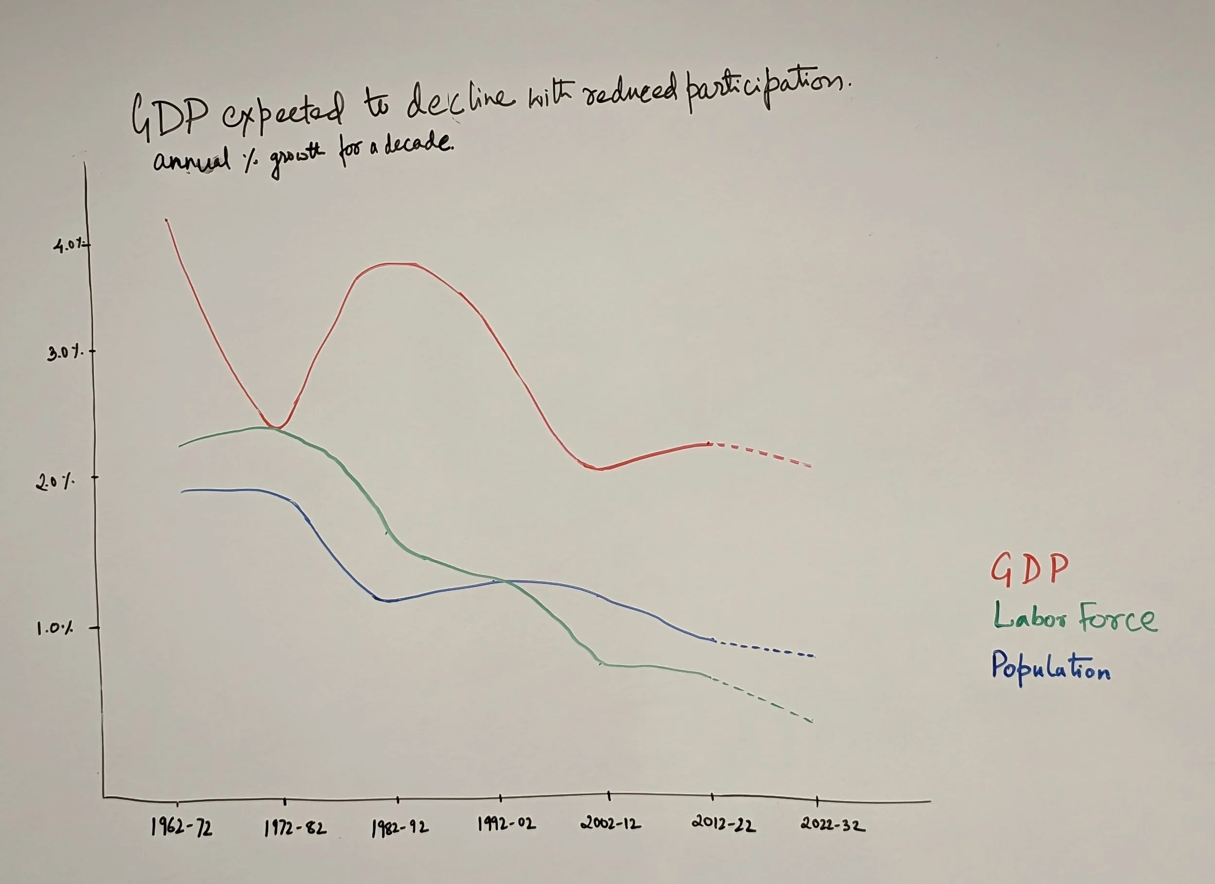
Image - Rough sketch of the initial idea that encompassed some of the initial concerns
Step 3: Soliciting feedback
We often tend to fall prey to confirmation bias or tunnel vision. The next step in designing through critique was to step back and seek out feedback. This not only helped test my initial ideas for making the story more clear but also understand the visualization from a different perspective.
The exercise for this step was to show this prototype version of the visualization and understand:
What people thought it was?
What the visualization was telling them?
Were there things that they found confusing?
Anything that they would change, if given a chance?
With these questions in mind, I spoke to my peers who come from different walks of life. I showed them my prototype and asked open-ended questions about the visualization. Below is a summary of those conversations.
Male 26, American
Able to understand that there is a decreasing trend in GDP and it is related to the decrease in labor force participation.
Not sure what does the data on population serve here.
The title seems to be explaining the visualization well but could highlight different time-periods
Female 25, Asian
The visualization shows me that there is significant drop since 2002; however, not sure about the relation between the three data points.
The X-axis labels are confusing. Each point represents a decade but the gap between two points doesn’t have any time change.
Male 22, Asian
The trends in the data seem to be varying a lot. Makes me wonder whether there were political crisis or black-swan events during this period.
Not sure how the population and labor force are related to each other and the GDP.
Step 4: Incorporating feedback
A common theme across the three conversations was that the relation between population, labor force, and GDP was not clear. Internally, my initial response to these comments was that the trends are speculative and the initial visualization might just be showing a correlation and not a causation. However, I decided to research this and to my surprise found out that there is a causation relationship.
Population affects the GDP but not directly. An increase in number of people would increase the number of people in the work force. An increased workforce would mean increased productivity eventually leading to more goods being produced (GDP). Sounds simple right? Well the catch here is that any change in population would affect GDP only after approximately 20 years. This is because people start contributing directly to the GDP only after the age of 20.
With this new insight, my prototype visualization was telling me much more that what I had initially gained from it. Not only is the growth in Population and Labor force decreasing, their relative trend has reversed after the 1902-2002 time period. What I mean here is that the growth in labor force was higher than the growth in population before 1902, which would mean that growth in GDP would not be affected drastically even if the population growth slows. However, after 2002, the growth in labor force has slowed down when compared to population. This signifies that people are increasingly opting to not contribute towards the work force as they used before. Which would mean an exacerbated decline in GDP is imminent. Hoping to convey these ideas, I made an attempt to re-do my prototype.

Building on the prototype, I made this new visualization with some minor changes. Firstly, I removed old GDP data points to help viewers only focus on the relation between different data points and the projections. Further, I also highlighted a 10-year time period in both population and GDP data to help users see the similarity in the trend. To make this fool-proof, I decided to add a short text within the visualization, driving the point home. Further, I decided to modify the title to include both the main idea of the visualization and the legend. This I believe simplifies the visualization further and helps the viewers focus only on the key idea. I also decided to highlight the relative change in Population and Labor force for the entire time period with contrasting colors. This I assume will help capture a viewers attention to this important piece of information.